Learning how to make a cover from a pro
.jpg)
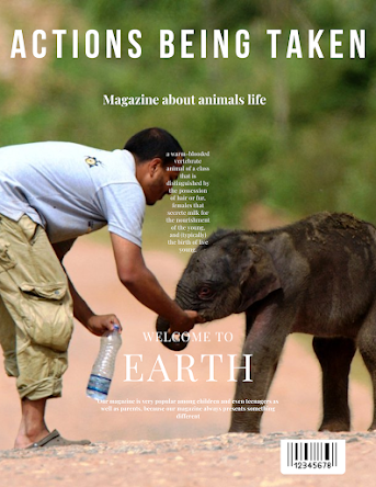
While searching for ideas for my own magazine cover about animals, I came across all kinds of interesting examples. Some covers were very busy and full of details, with bright colors and big words that really caught my attention. These “crazy” magazine covers had so much going on that it was almost hard to know where to look first. They had big, bold letters, lots of different pictures, and multiple smaller headlines pointing to various topics. It seemed like every part of the cover was trying to get my attention at the same time, which made it interesting look at. Other covers, though, were much simpler and seemed calmer. These covers had a clean design, often with only one main picture or headline. The simpler covers focused on a single topic and didn’t have too much text or too many pictures, which made them feel more organized and easier to read. They usually had one clear, strong image, like of an animal or nature scene, and one main title that was easy to understand and remember....